
Papa Johns
‘Better Get You Some’
‘Better Get You Some’ of this brand new, distinctive Papa Johns design system that brings new life to classic ingredients, new energy to the brand voice, and new excitement to the brands place in culture. More than just a logo, a color palette, or a typography treatment. We designed a whole visual world built to be flexible in how it comes to life, but specific in its creative cohesion and consistency.
Agency: The Martin Agency
Role: Design Director
Creative Team: Anna Vaughn & Page Jensen Slattengren
Designer: Jenni Renas


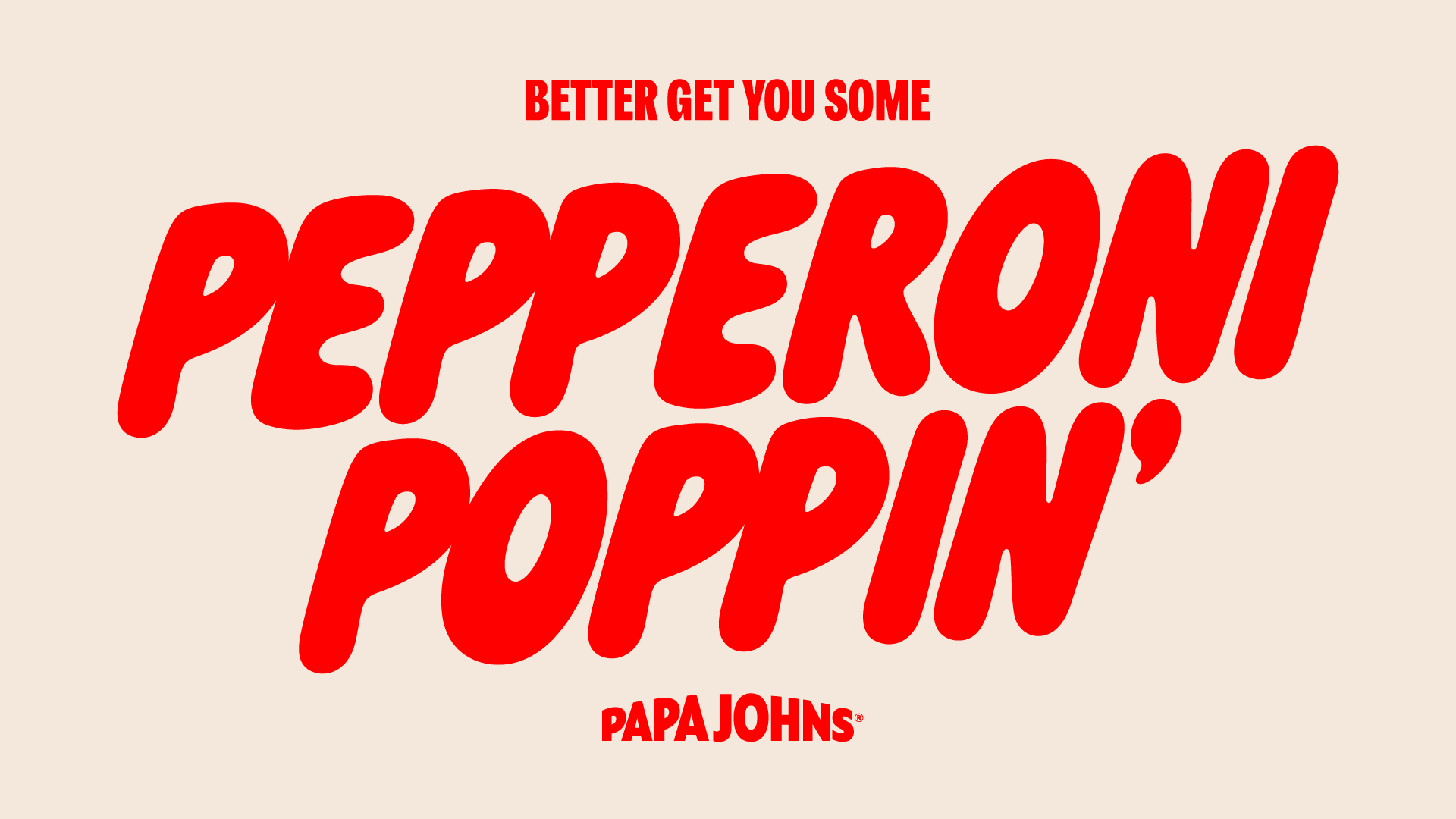
Typography
Typography is a key standout moment in the visual system. The intentional juxtaposition of an ultra-legible, brand-established typeface, with an all-new, hand-drawn font with freeform letters serves a dual purpose as both practical & personality-filled.
‘Pappy’ is our brand new, fully bespoke typeface specially designed for the brand. The intention behind the design is two-fold: to inject a playful nature, and to connect more to the hand-made craft of Papa Johns pizza. The rounded corners, and the slight forward-leaning nature of each character were inspired by the form of a piece of dough as it flies up in the air, the splash of the red sauce as it lands on the dough, the pull of the stretchy cheese. Better Ingredients. Better Pizza. Better Typography.


Photography
In addition to a new graphic system, a bold new approach to photography was just as important to the visual world. It must be crave-inducing. The ultimate tantalizing glimpse of the best ingredients blended together to make the tastiest, cheesiest, sauciest visuals. We lean into tantalizing edge-to-edge macro photography that highlights the saucy, the crusty, the cheesy, the crave-driving ingredients.


